Case Study
Ark Curriculum
Ark, a pioneering organisation that brought the groundbreaking Maths Mastery to schools across the UK, approached us to help them consolidate their courses. We created an entirely new brand architecture and parent brand that gave greater clarity to their message.
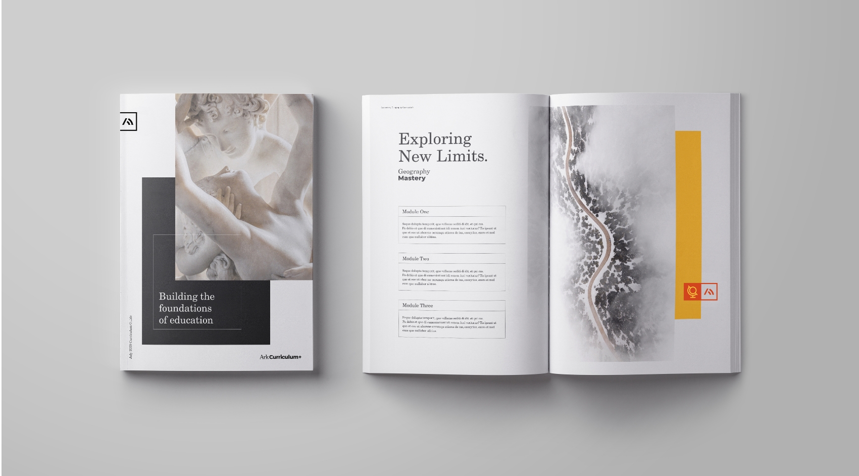
Having led the way in modern teaching, Ark had introduced other subjects to its growing portfolio but along the way, this had become disjointed. While every curriculum was created to the same standard, the way in which they were delivered and, more importantly, the needs of those using it differed.
We decided that it was time to harness the power of the collective – from our workshops and stakeholder research, we found that across the board, the way Ark supported schools at every level was the true defining factor for the organisation.

Through our research, it was evident that to make serious change across the UK education system, Ark had to be a platform for both teachers and users, supporting them and helping them develop.
Each Ark customer had their own need states, their own challenges and in many ways, their own way of working. So, instead of using the usual cliche demographics and trying to shoe-horn a collective of individual people into one mould, we looked at Value Mode Indicators as a way of categorising. Understanding these needs would be vital in how we communicated the brand and focusing in on certain archetypes would provide us with greater success in the short and long-term.
Through extensive stakeholder interviews, workshops and discussions with policymakers, teachers and students, we also established that Ark was misunderstood and poorly communicated. The value of a multi-curriculum, delivered through partner schools whilst heavily investing in the wider education system was not clear in their existing brand.
With a clearer understanding of Ark, we restructured the brand architecture and introduced an overarching parent brand – Ark Curriculum Plus.


This parent brand had to deliver a clear message: Delivering world-class education to every child, no matter their background or ability. The brand would also act as a beacon for teachers and education professionals, helping them to be the best they can be and supporting them at every level.
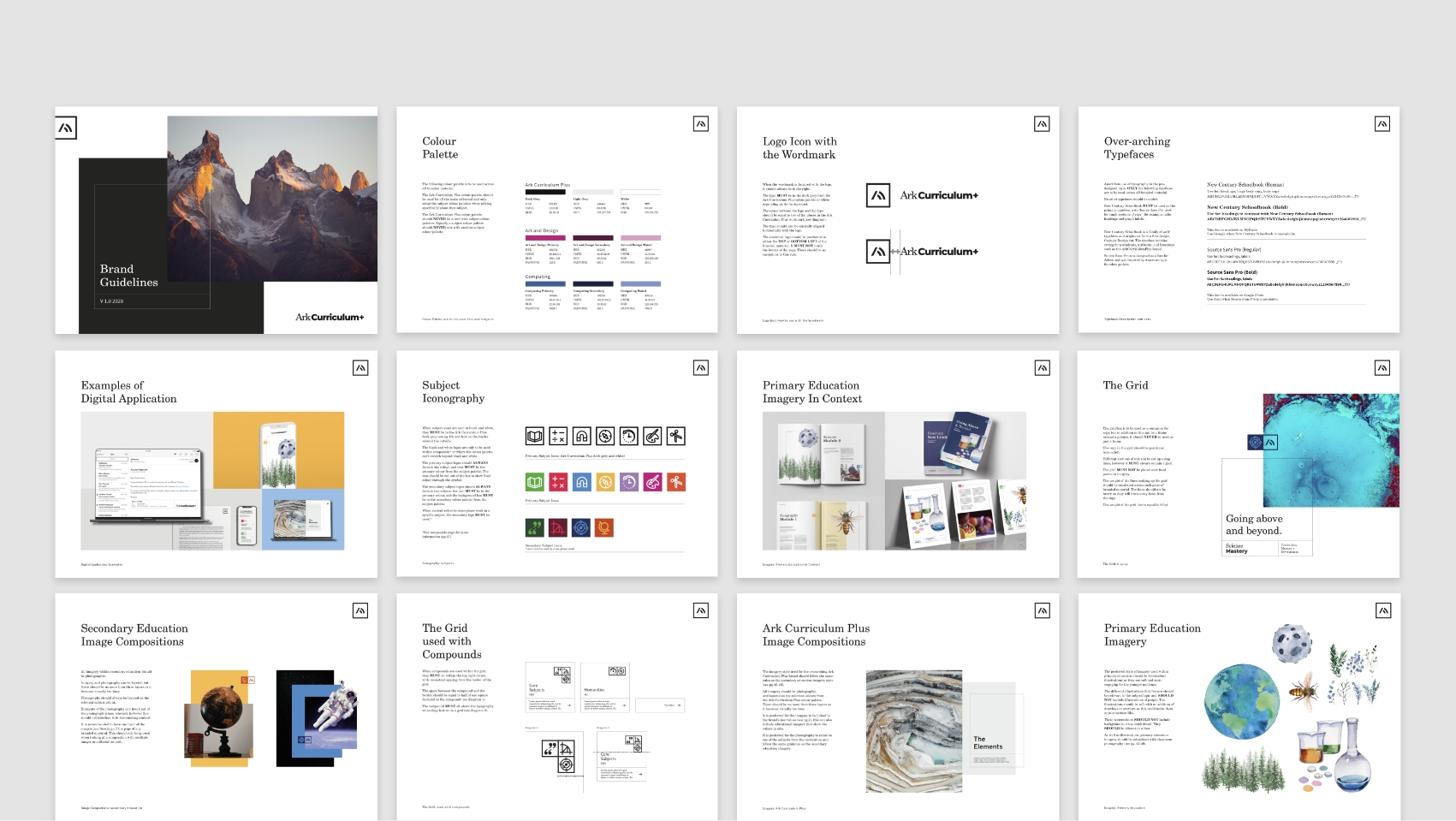
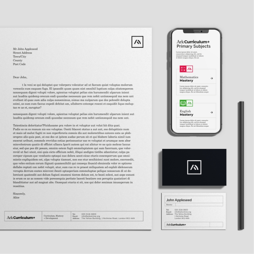
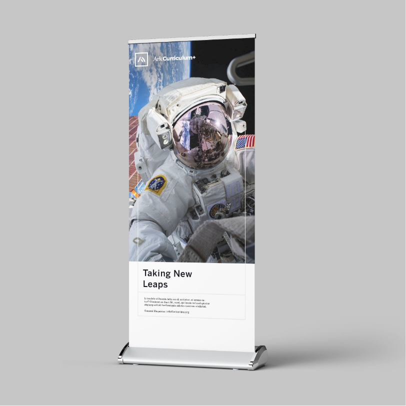
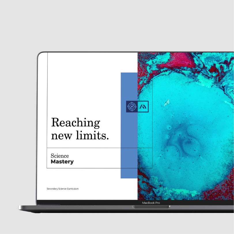
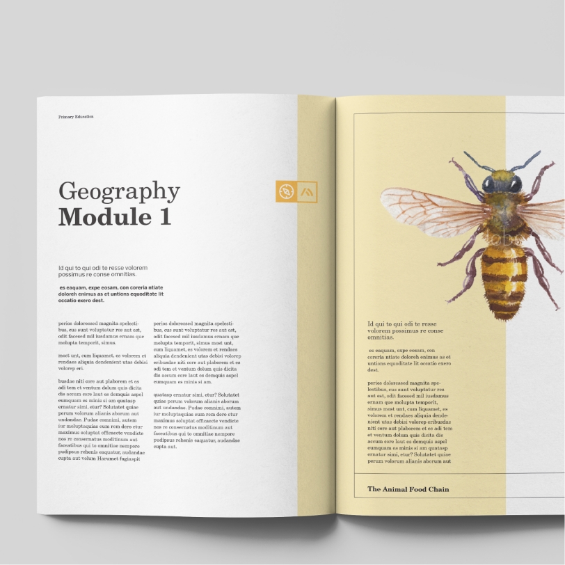
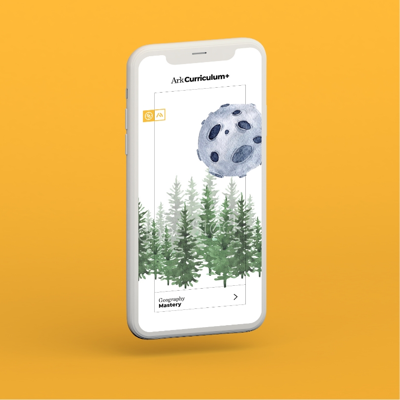
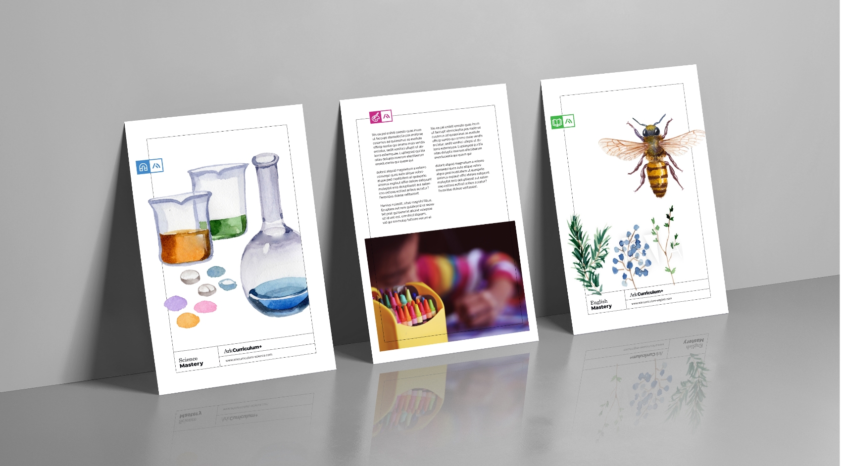
In order to create consistency across every touchpoint, we rebranded the subjects to work alongside the parent brand. We introduced a shared DNA in logo marks, colour palettes and iconography. This allowed every subject to stand alone, but always be supported and endorsed by the parent brand, leading to greater brand recognition and unity.
