Case Study
DoorCo
One of the UK’s leading door manufacturers, DoorCo came to us at a crucial stage of growth looking for a new brochure. However, we soon discovered that much more was needed, and developed an award-winning brand.
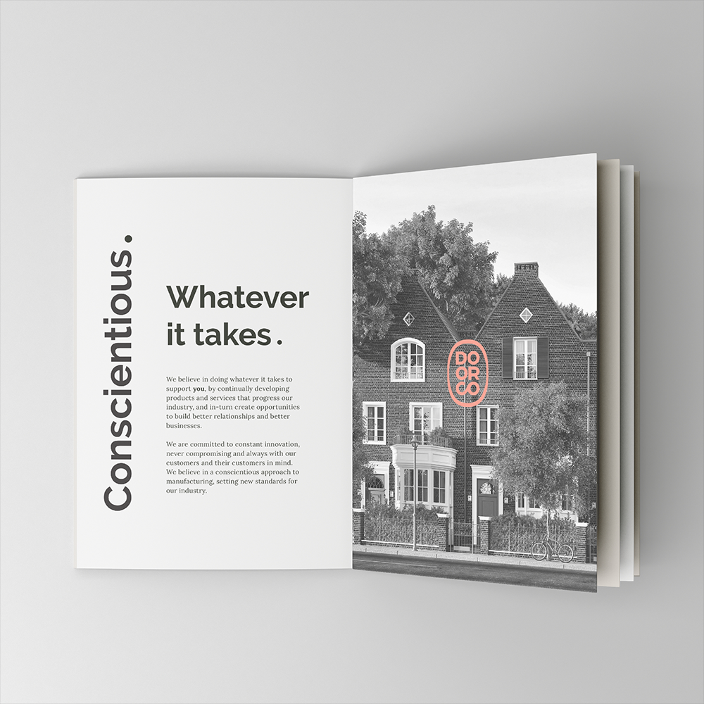
Through our DIG™ process, it became clear that what makes DoorCo unique is their commitment to constant innovation and keeping their customers at the heart of everything they do. We then brought this to life with extensive brand guidelines, multiple sub-brands and design concepts across online and offline channels.
This gave the company far greater opportunities than a simple brochure, with a brand that could be built upon and that would hold them in good stead for a brighter future. As a result, in just six months after launch, the new DoorCo brand won two design awards, including the prestigious G21 award for Best Promotional Campaign.
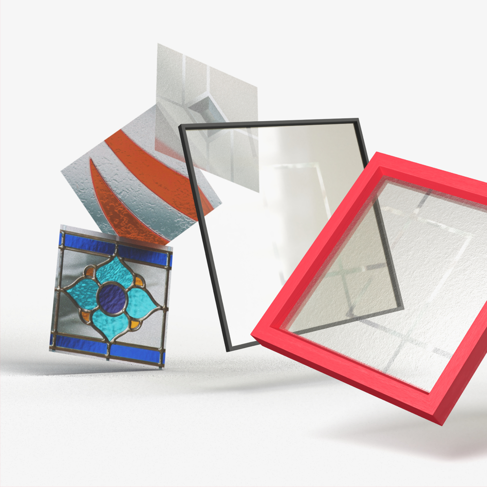
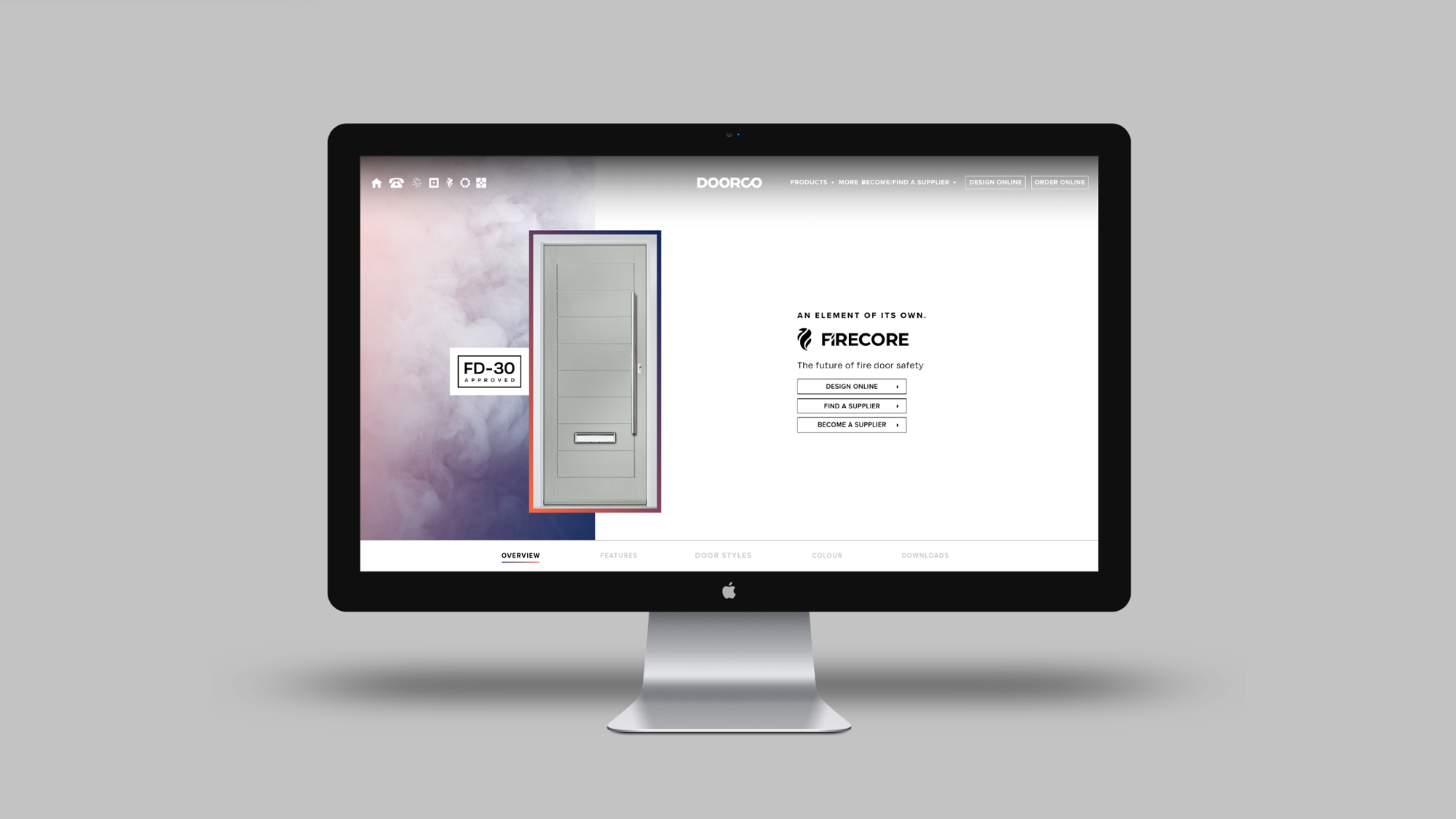
Following the success of the rebrand, we were asked to name and brand DoorCo’s newest product range – an innovative glazing cassette system, now known as FLiP. To really make an impact on the market, we needed to take a pioneering approach. We created an uncompromisingly, energetic brand that had the ability to be loud and brave when necessary.
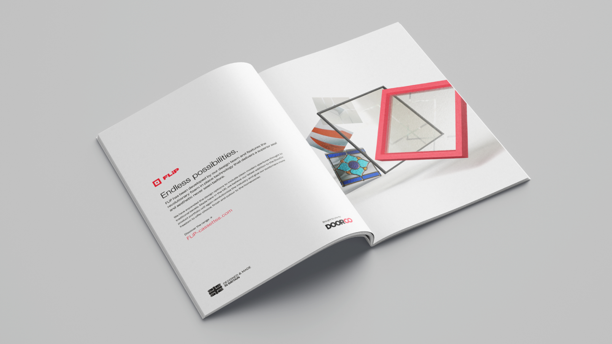
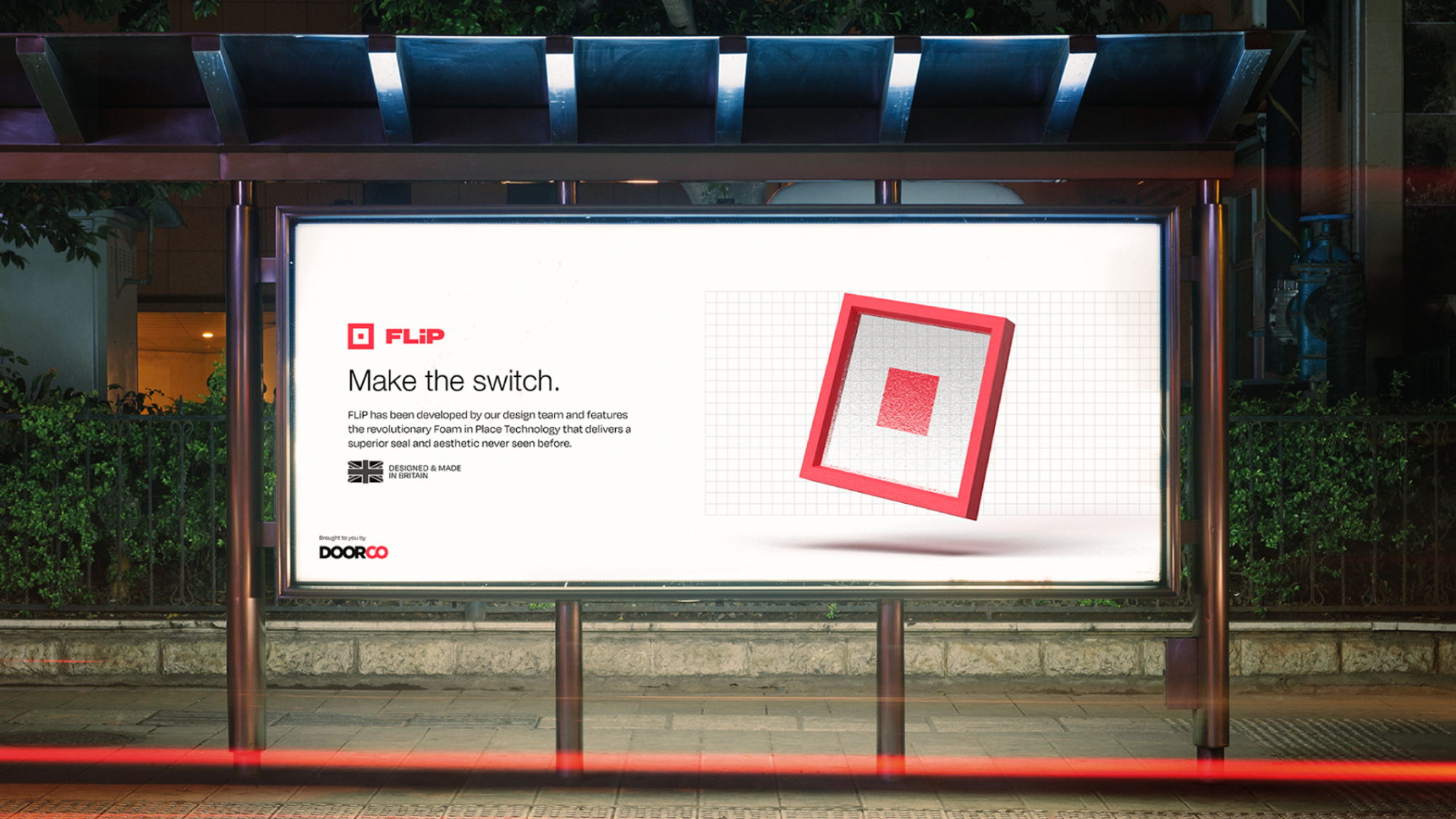
We broke the launch campaign down into two stages. The first was a minimalistic insight that provided the definition of 'flip' and introduced the logo. This created curiosity within the industry and a glimpse of the FLiP identity. We then launched the brand that showed the set of three styles available and highlighted the 'endless possibilities' USP, across print adverts, social platforms, digital marketing, and animation.
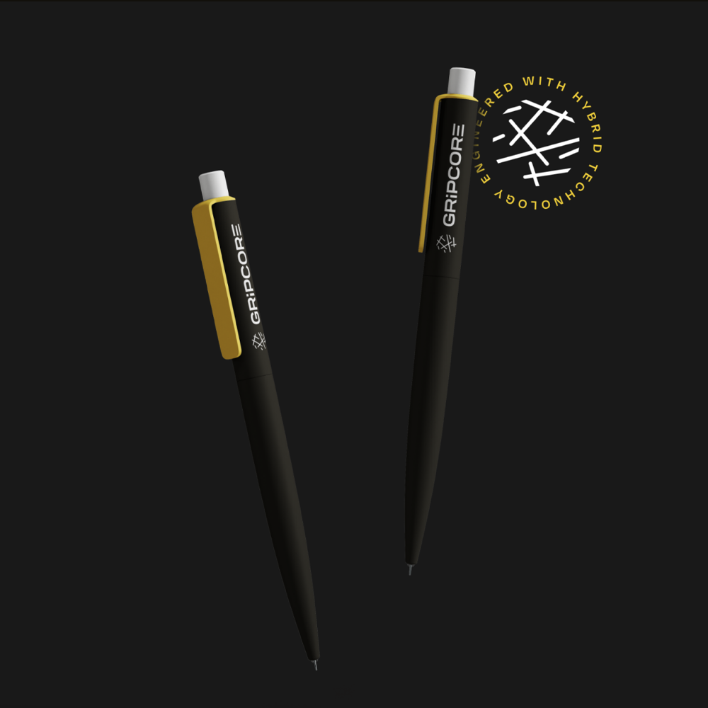
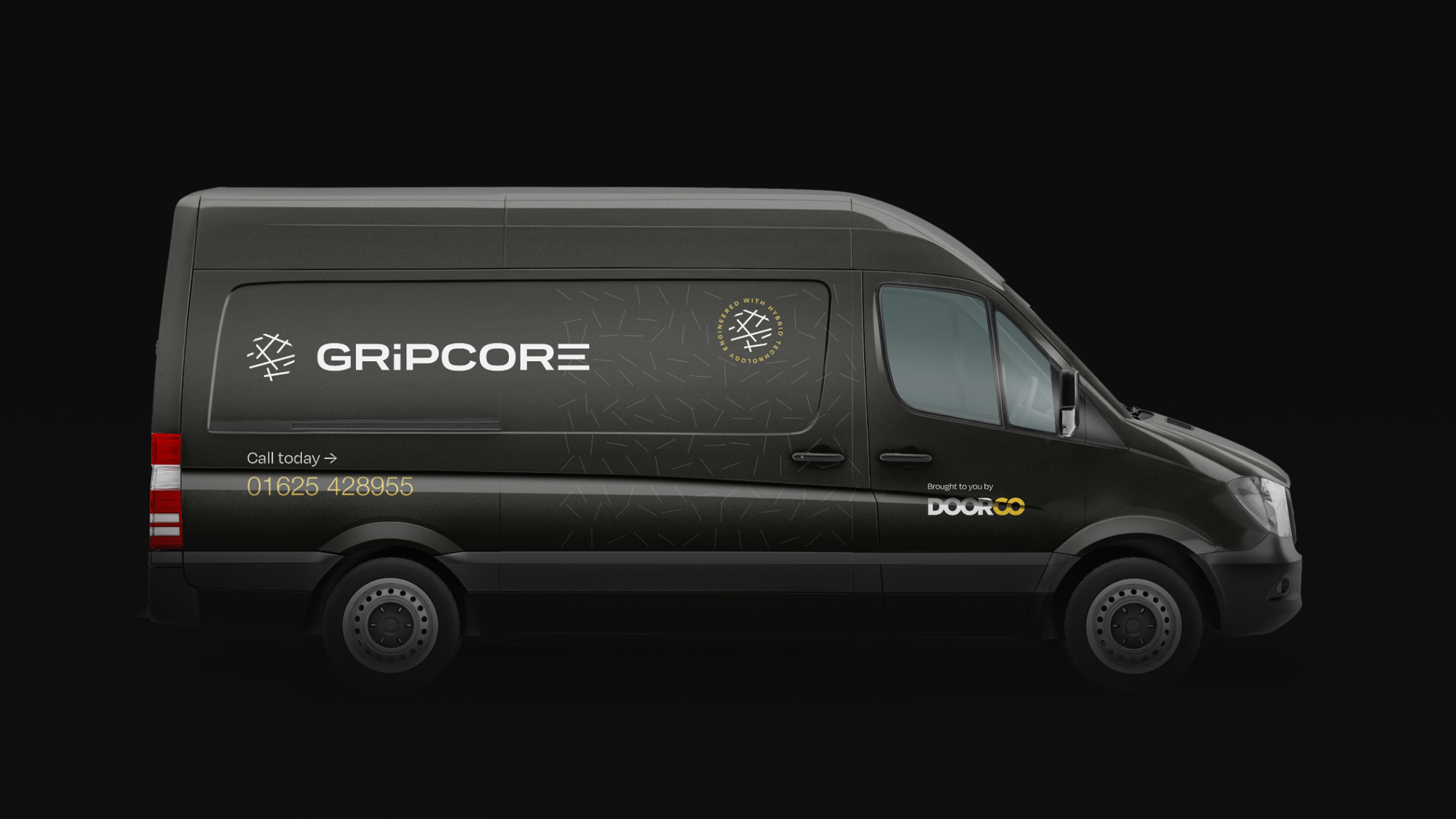
We also created a unique brand identity for the new flagship range GRiPCORE. We took inspiration from manufacturing and technology giants, like Dyson, Audi and Intel when directing the look and feel, focusing on creating relevant assets that add credibility to the brand, supported by state-of-the-art CGI imagery.
As the GRiPCORE is something DoorCo wanted to take proud ownership of, we created a stamp, with the fibres of the skin, that they can use to quality assure products with. The heavy use of black gives the brand a high-tech and sophisticated feel, much like Apple uses, but with an impactful yellow to offer contrast and energy.
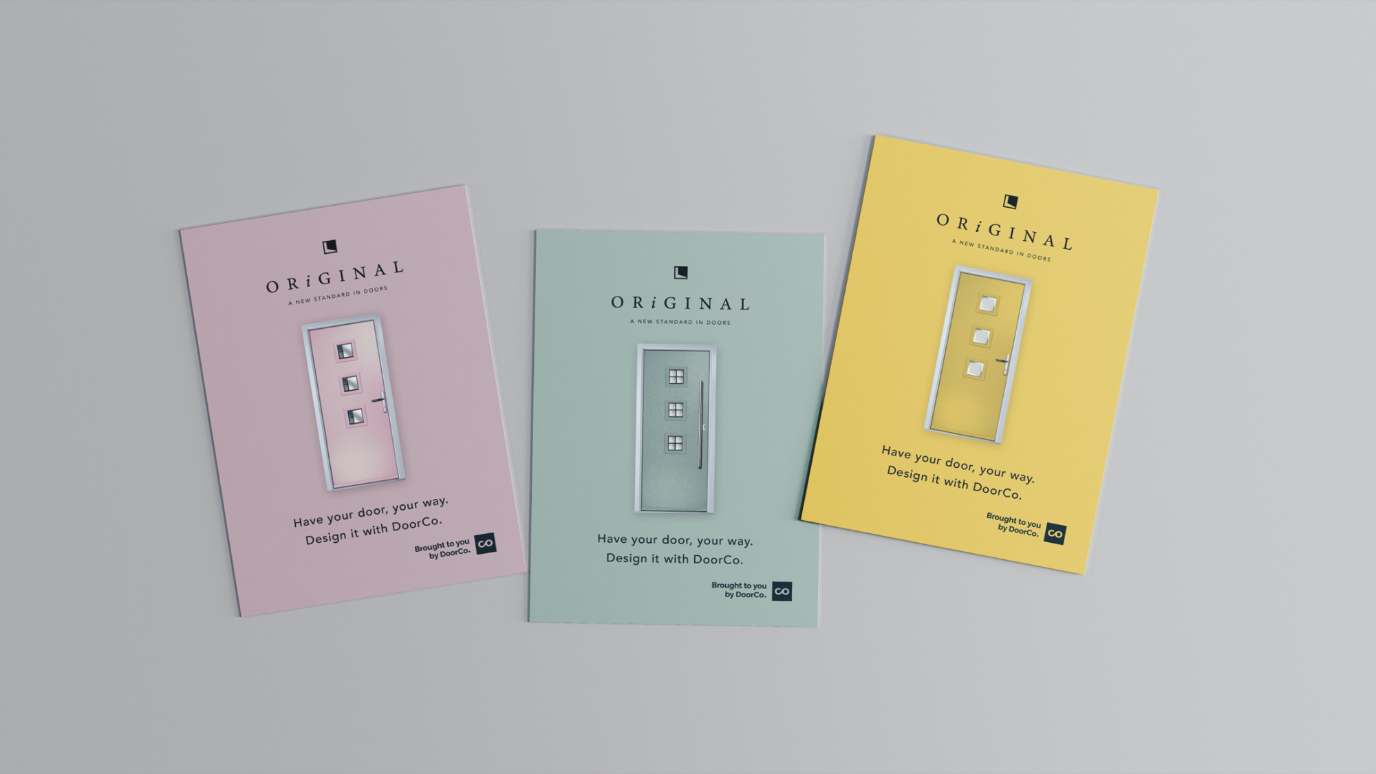
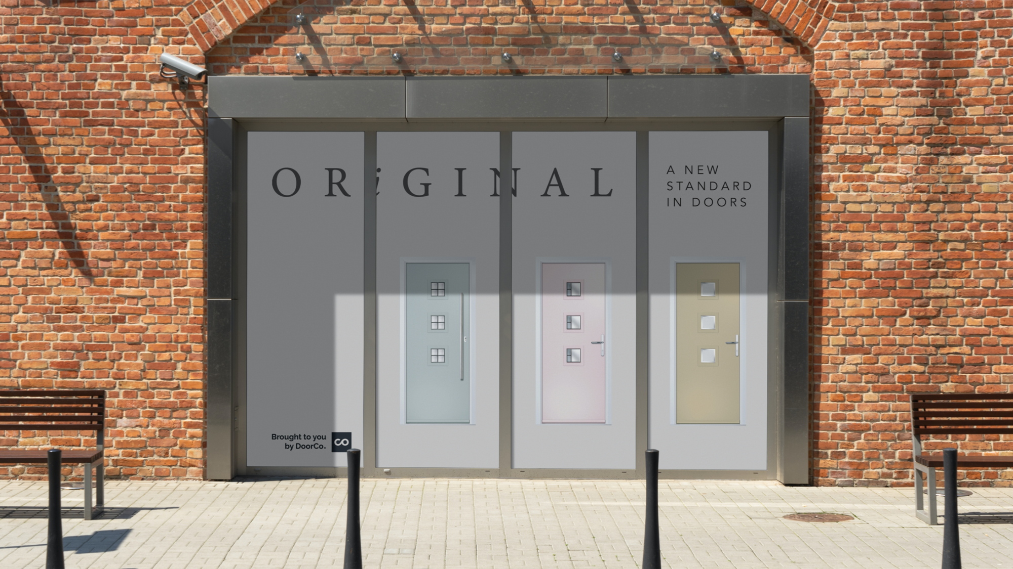
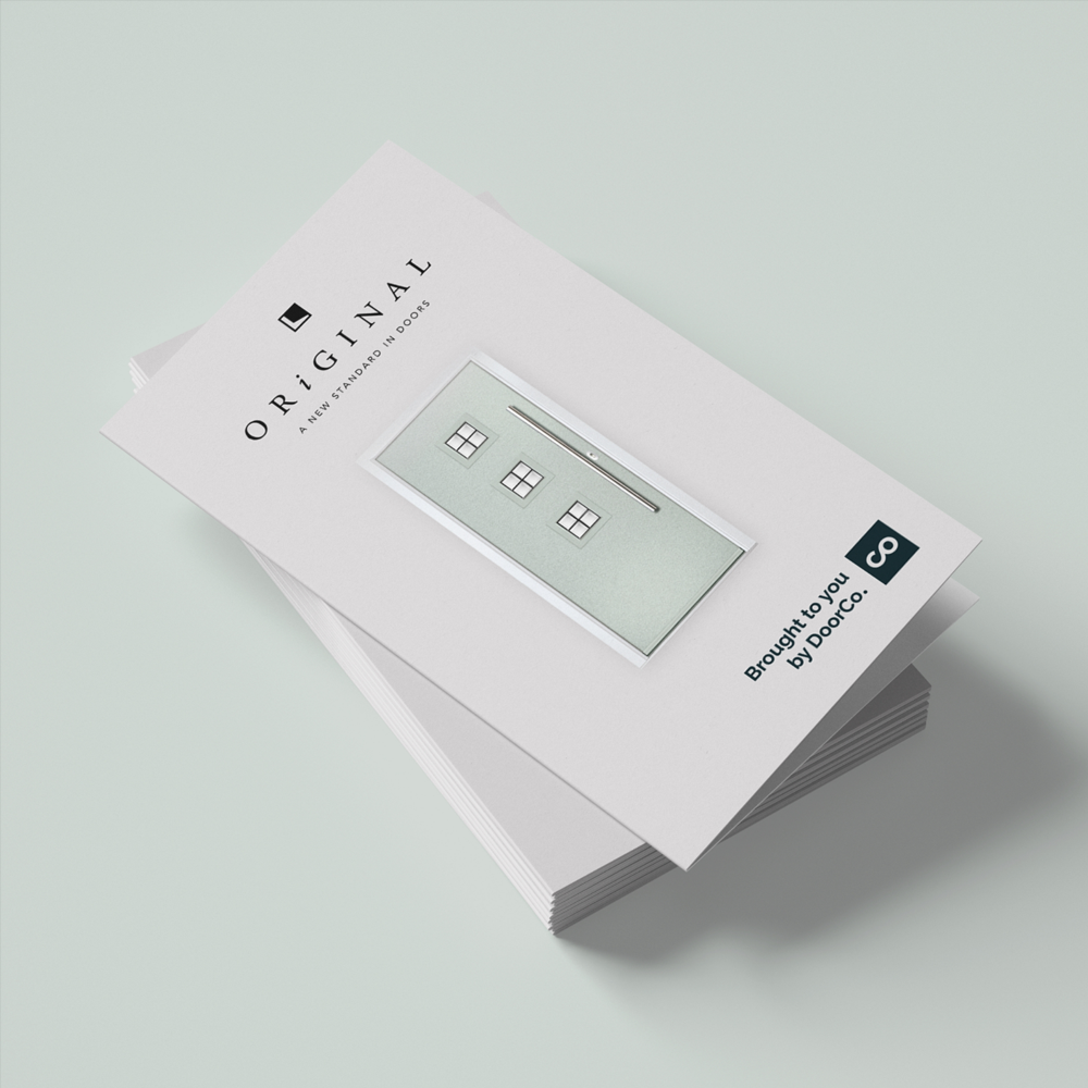
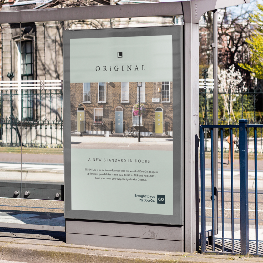
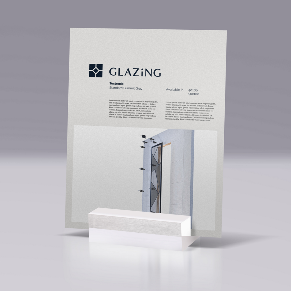
Most recently, we gave a fresh new feel to DoorCo's 'ORiGINAL' range. This range represents an inclusive doorway into the world of DoorCo, with a simple but contemporary design mirroring the products. Consequently, we needed to demonstrate the wide collection of products through imagery and colour to reflect the customisation options, producing numerous assets to help the team throughout the sales process.