Case Study
Dunkertons
Dunkertons have pioneered organic cider making for over 30 years – it was now time for the brand and packaging to reflect the liquid inside. They turned to us to rip up the rule book and create a new one.
Working alongside the team at Dunkertons, we delved into the process of cider making to truly understand what made each drink unique. Working with Julian and his team was a new experience for us all.
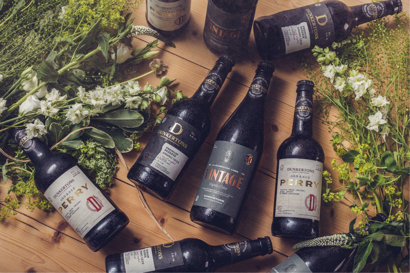
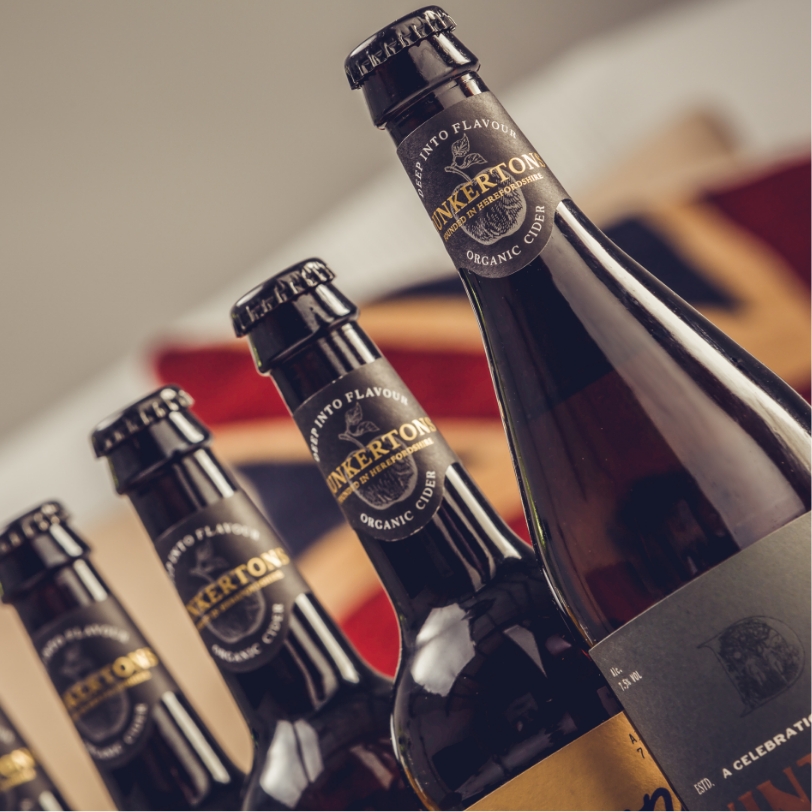
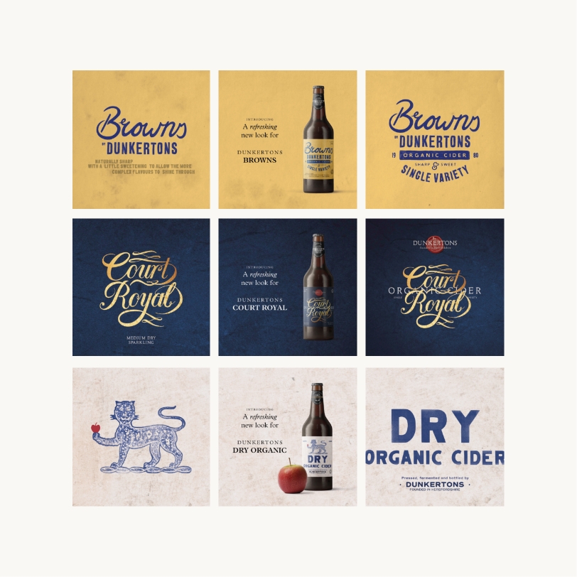
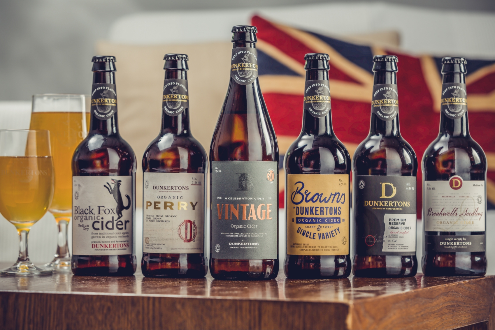
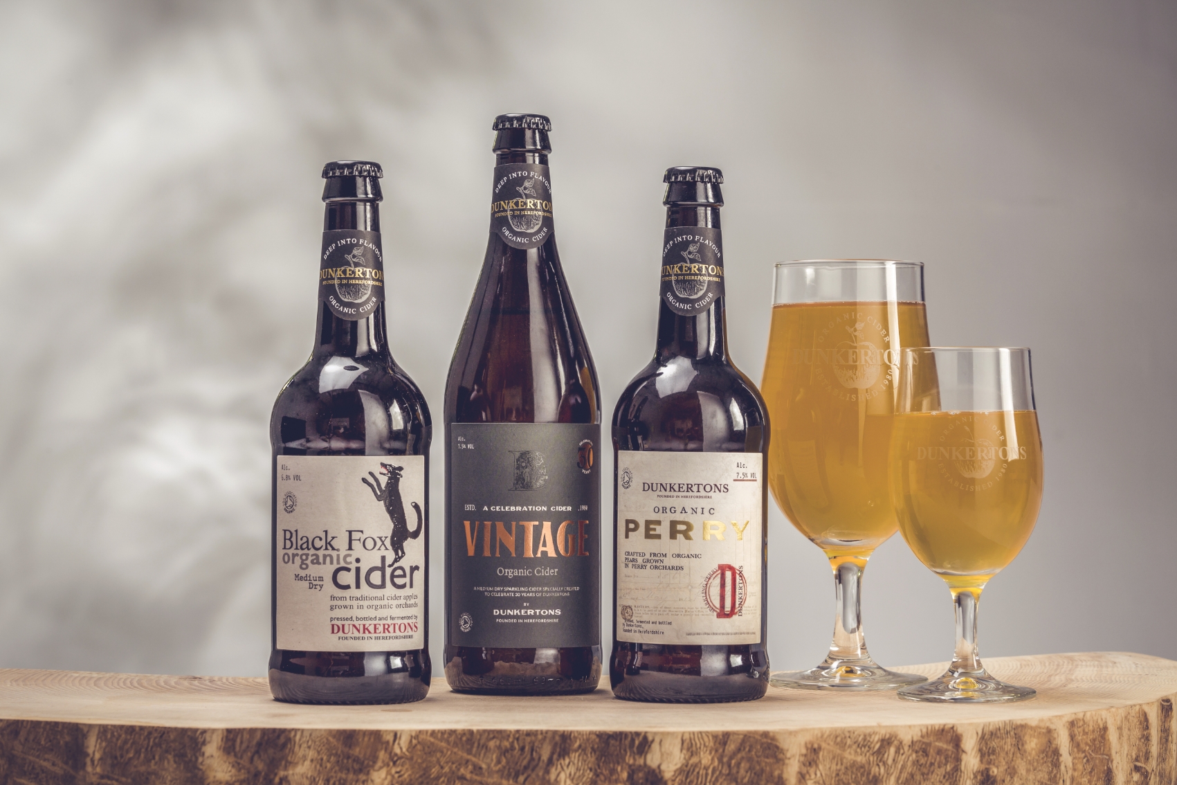
The workshops consisted of discussions around textures, colours and how every bottle should tell a story. This was not about creating a line-up of ‘me too’ bottles – like an army of cider soldiers. They didn’t want convention, consistency or complacency. What Dunkertons wanted was for every bottle to appear unique bubbling with character and intrigue.
Through our extensive research, we found that cider was typically undervalued and misunderstood. Consumers were not aware that making cider is closer to wine making than brewing and this had to change. It was time to tell the story of the unique apples used in every variant and the flavours this created. Much like wine, we talked of tasting notes, smells and how to pair them with foods.
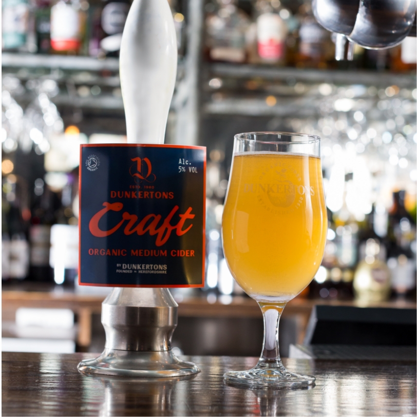
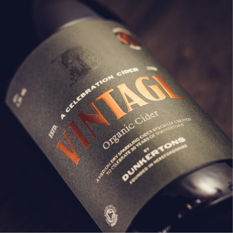
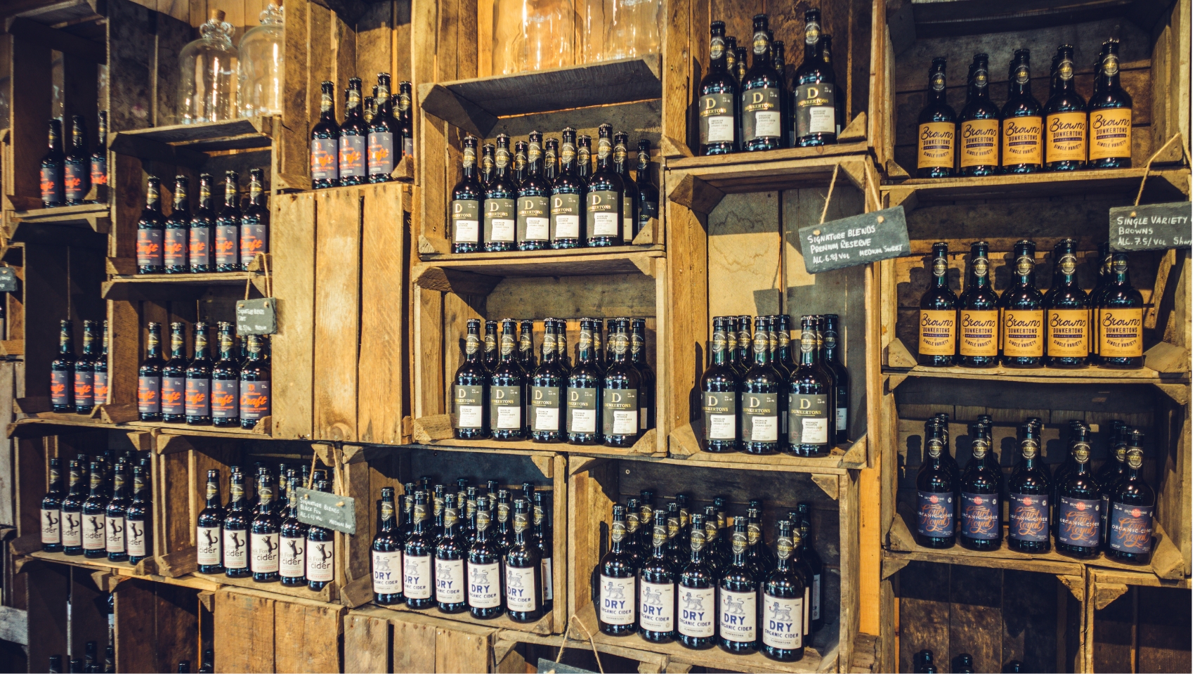
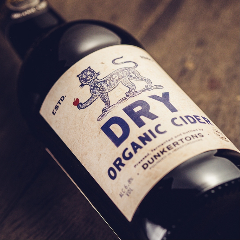
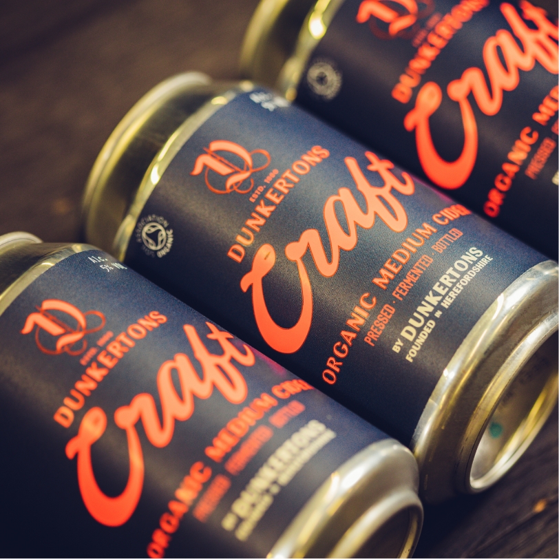
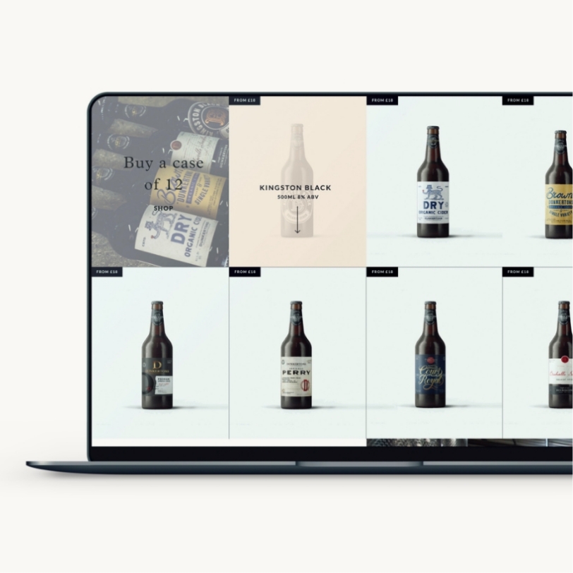
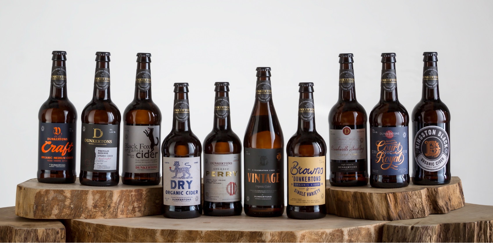
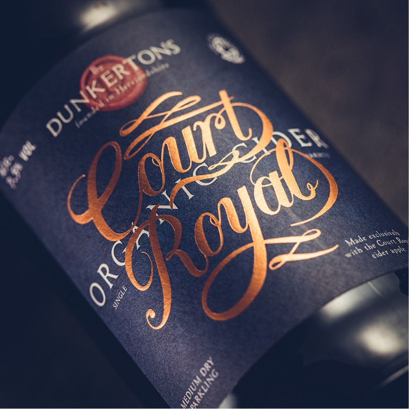
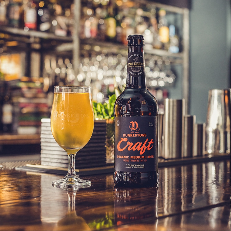
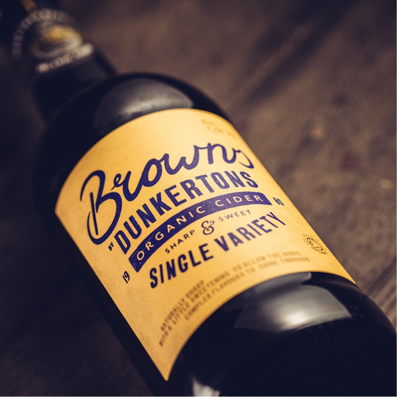
Armed with this knowledge, we created a ‘style’ for each of Dunkertons cider, including textures, colourways and a unique ‘D’ on every pack. Like the artisanal approach to cider making, every label was hand drawn from scratch by our designers before working with the label printers on stock and print finishes. The end result is a stunning range of labels, each with their own personality and style.