Case Study
Storeaway
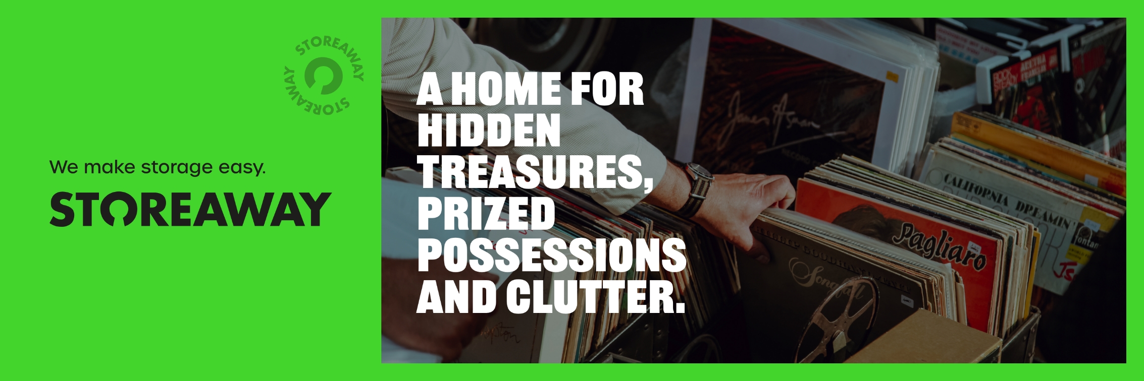
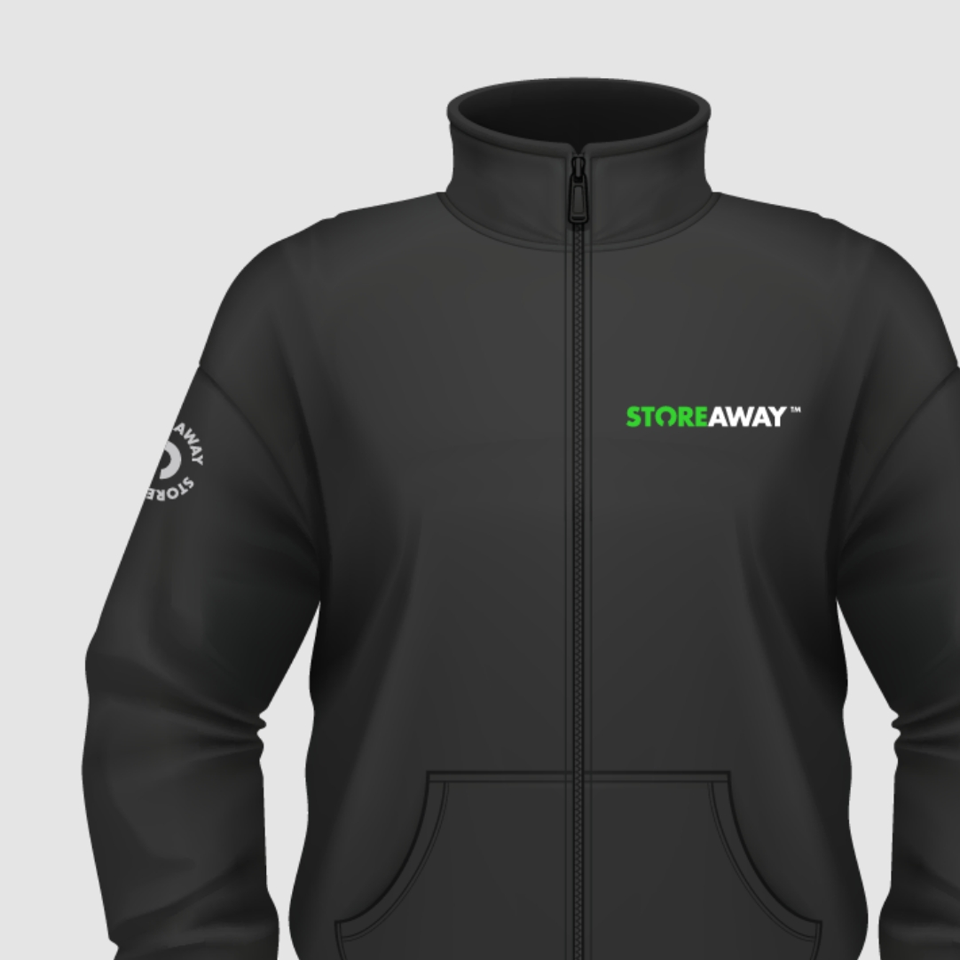
StoreAway are a new storage company that needed to make an impact in a competitive industry. They handed the reins over to us to create a bold, vibrant and playful brand identity that would inspire people to choose them.

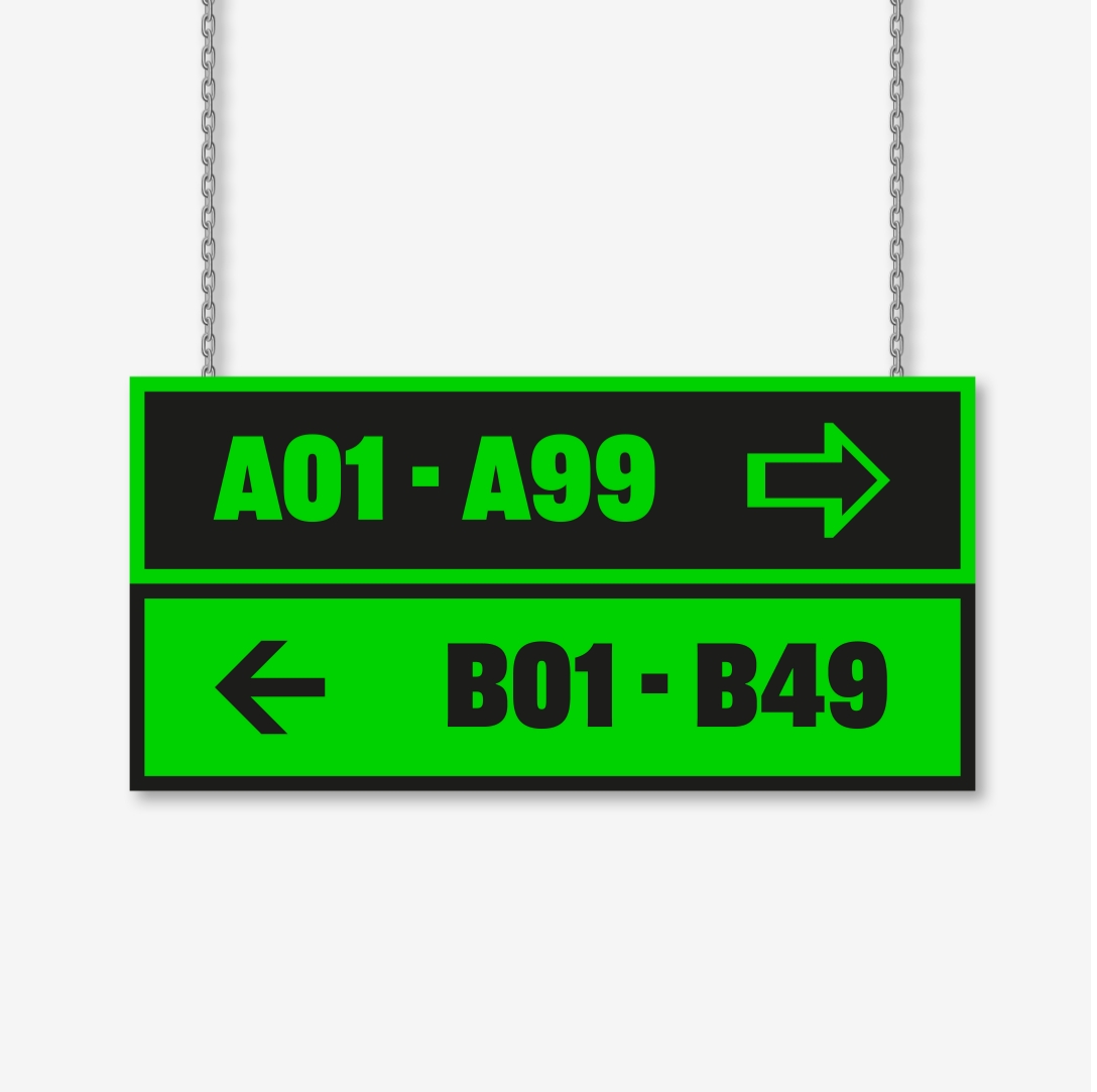
StoreAway first contacted us as they were planning to open a facility in Cheltenham and needed wayfinder signage, but after an initial chat with the team, we knew that much more was needed to attract the kind of audience they wanted. Traditionally, storage companies operate out of town in retail parks, but StoreAway are different – they wanted a central location, so that students, homeowners, renters and even independent shop owners in need of extra inventory space would have quick access to their belongings.
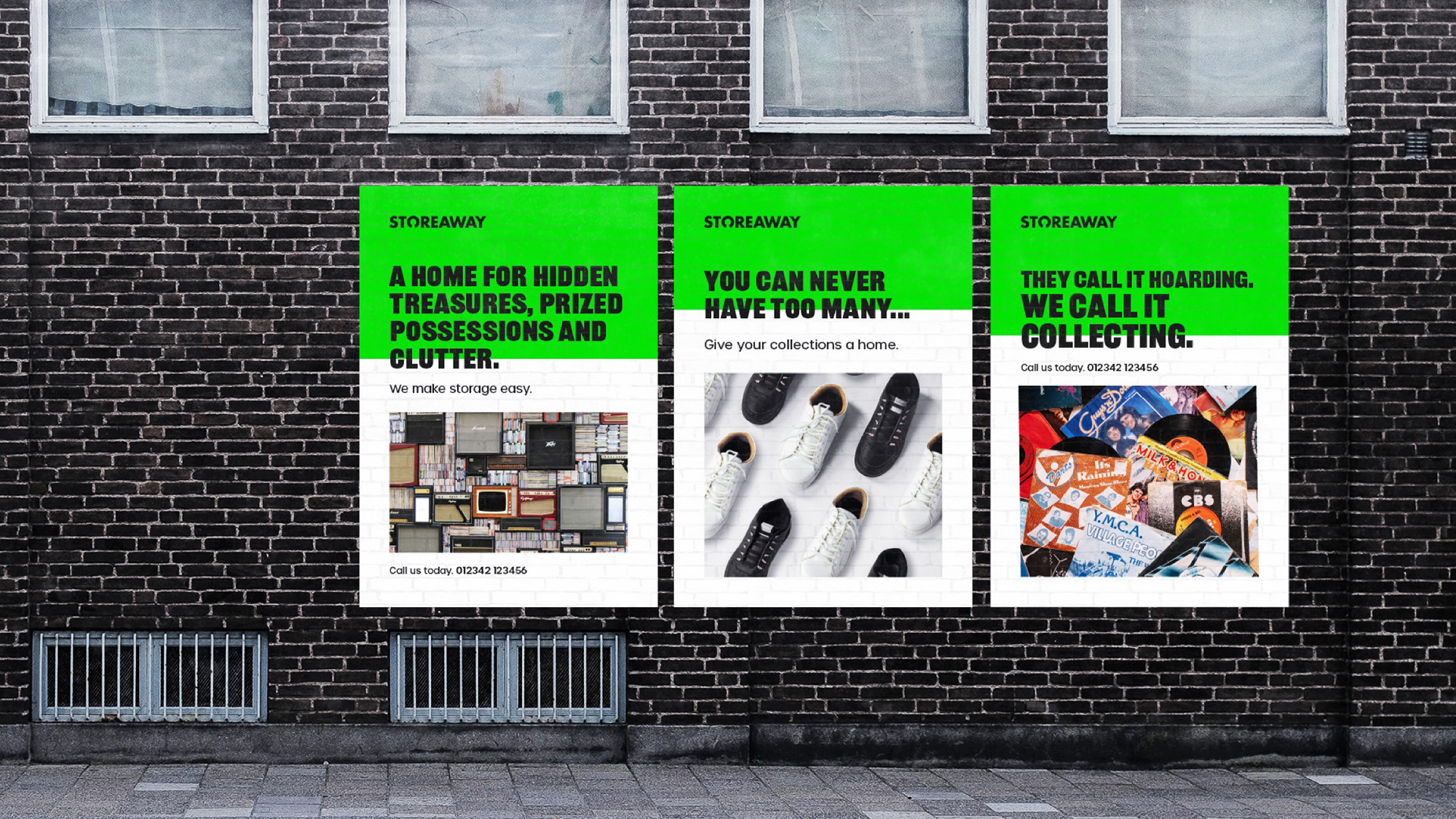
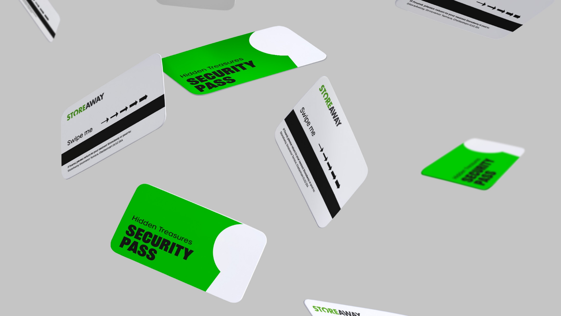
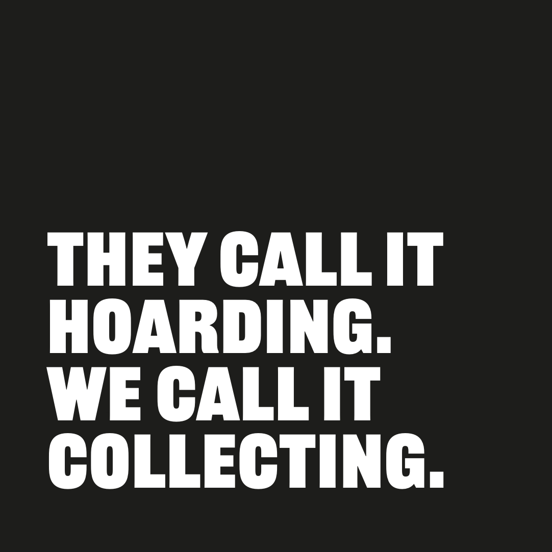
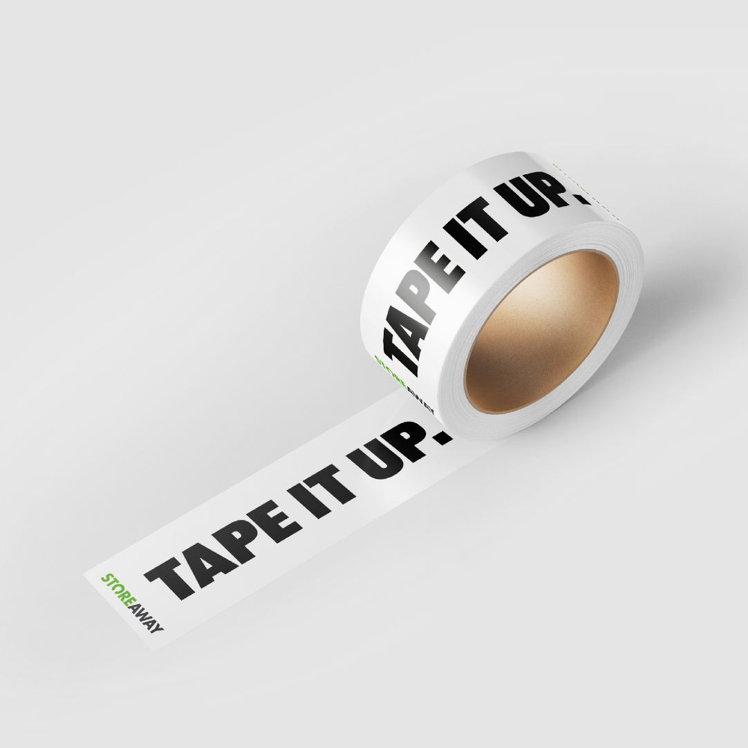
We held a creative session with them and developed a much wider brand identity, utilising their bright green colours to create fun and easily recognisable iconography, as well as key messages that positioned them as the anti-Marie Kondo – “they call it clutter, we call it collecting” being just one of them.
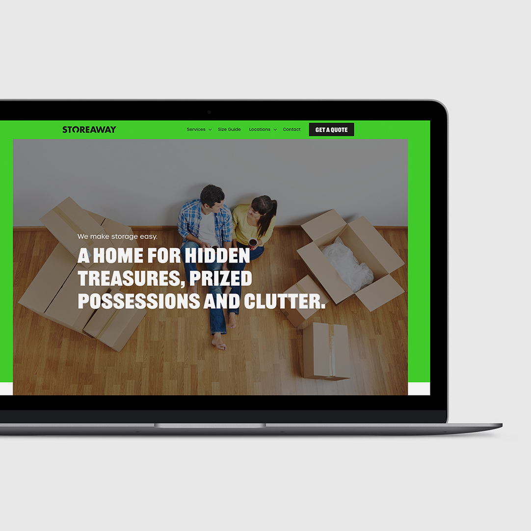
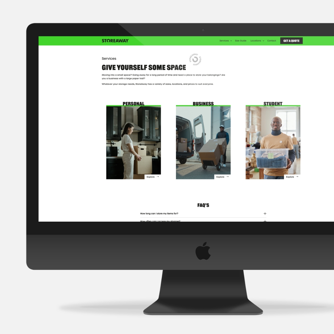
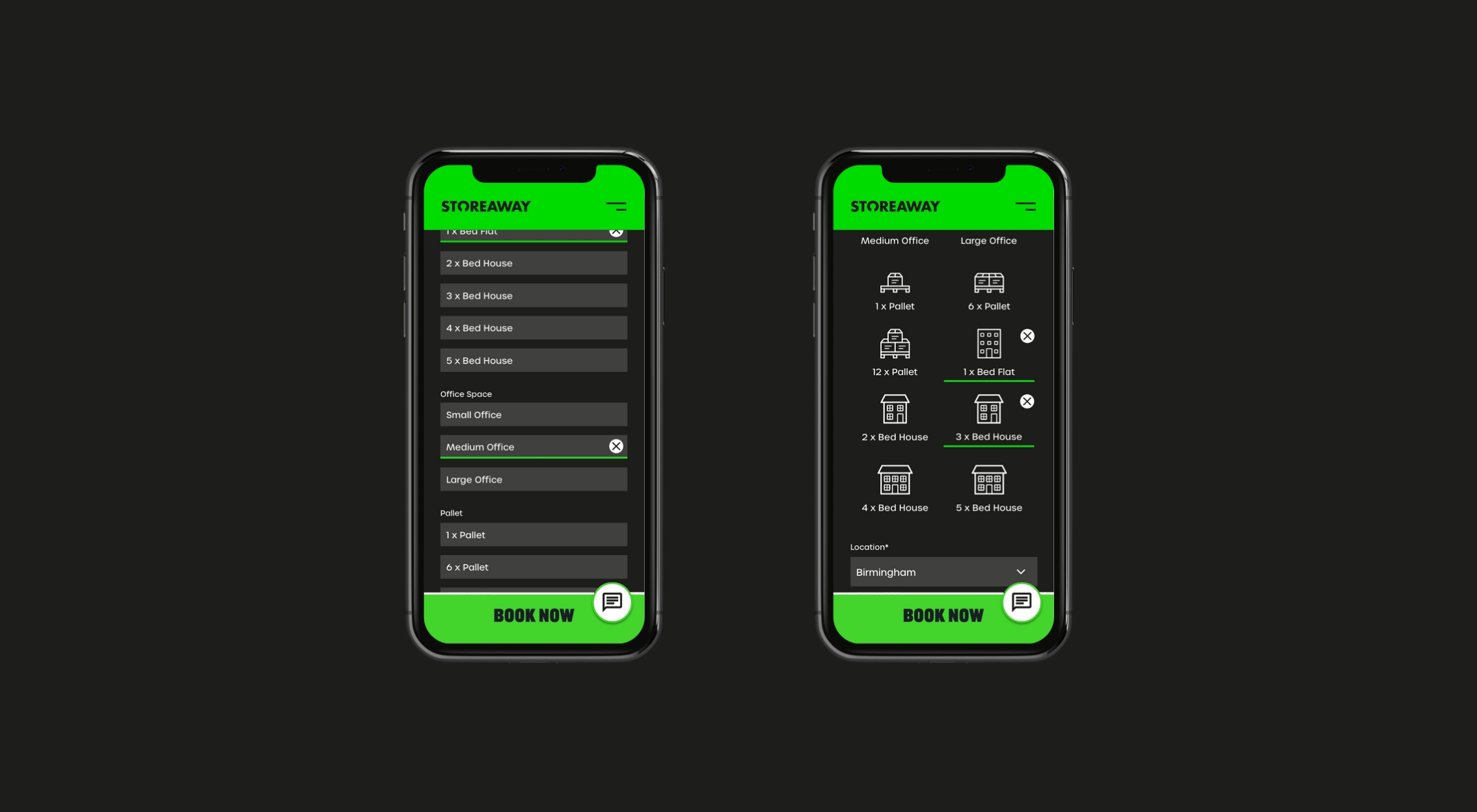
As StoreAway’s plans changed and they were getting ready to bring even more facilities online, we created wayfinder signage for each of their upcoming locations. We also designed a new website that put StoreAway’s messaging front and centre, while helping potential customers decide exactly what space they needed with a handy size calculator.